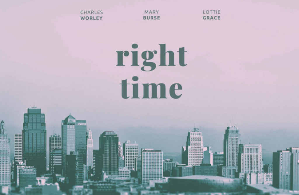
If you are not an art student and have never studied design, you might be confused about how to actually make a poster. There are many posters on the market that are dazzling and colorful, but when it comes to making your own, you might feel completely lost.
Designing a commercial poster involves multiple steps and key points. Here is a detailed guide:
1. Define Your Goal and Audience
- Clarify the Purpose: First, clarify the purpose of the poster. Is it to promote a product, service, or event?
- Understand Your Audience: Understand your target audience, their preferences, age group, gender, occupation, etc. This helps in designing a more appealing poster.
2. Copy and Information
- Main Information: Many people think that the most important part of making a poster is handling the images, but it's not. We should first focus on the text, ensuring the main information (such as product name, event time, location, etc.) stands out.
- Text Groups: Different types of text form a group. A poster can have one or multiple text groups. Pay attention to the hierarchy and style of each text group, ensuring strong contrast and appropriate style.
- Concise Copy: The copy should be concise and clear, avoiding too much text, making important information immediately apparent.
- Call to Action: Use attractive call-to-action phrases like "Buy Now," "Limited Time Offer," etc.
- Font Choice: Choose readable fonts, making the title font eye-catching and the body text clear.

3. Visual Elements
- Image Selection: Use high-quality, theme-related images. Ensure the images are clear and visually impactful. Remove background elements to focus on the subject and enhance the overall visual appeal. The images can be actual photographs, illustrations, or 3D renderings.
- Brand Elements: Include brand logos, colors, and fonts to maintain brand consistency.
- Color Scheme: Choose colors that match the brand image and target audience. Avoid using too many colors; usually, 2-3 main colors are sufficient. Ensure the text information hierarchy is above the background information hierarchy.
- Texture Application: Experiment with different textures or artistic effects in graphic design, such as weathered effects, color halftones, torn paper art, collage art, etc. These effects can alleviate the monotony of minimal information layout and enhance the richness and texture of the visual.

4. Layout and Design
- Hierarchy: Common structures include top-down, left-right, diagonal, and other layouts. Top-down and left-right structures are stable and usually foolproof, while diagonal structures highlight movement and have a sense of conflict and contrast.
- Core Area: The core area is the central part of the page where the main content is located. Ensure the most important information is seen first.
- White Space: Utilize white space effectively to prevent the poster from looking cluttered and to enhance readability.
- Symmetry and Balance: Maintain visual symmetry and balance to ensure the poster looks harmonious overall.
- Repetitive Composition: Repetition is a common design technique where basic shapes are arranged repeatedly to create a new and visually striking form, adding depth to the design space.

5. Design Tools
- Design Software: Common design software includes Adobe Photoshop, Illustrator, InDesign, etc.
- Templates and Resources: Use available templates and resource websites (such as Canva, Envato Elements) to speed up the design process.
6. Finishing Touches
- Size and Resolution: Choose the appropriate size and resolution based on printing requirements. Save the poster as a high-quality PDF or TIFF file to ensure it prints without distortion.
- Review and Feedback: Check spelling, layout, and color details to ensure there are no errors. Ask colleagues or friends for feedback and make adjustments accordingly.
- Distribution: Determine the distribution channels for the poster. If it needs to be displayed in stores or exhibitions, print it carefully to ensure the colors and layout meet expectations. For online media or websites, only an electronic version of the poster is needed.
After reading these steps, you should no longer feel completely lost about poster design. Give it a try and experience the process yourself!